Design
Helsinki Coffee Festival organizers launched a new event in 2018. The delicious event is open for all ages with activities for children and adults. I was assigned to design the visual identity.
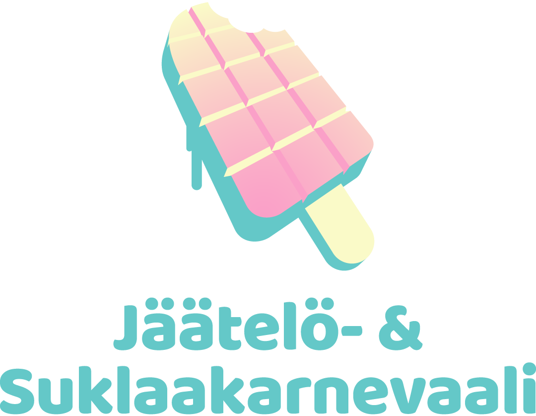

I wanted to include both concepts in the logo. I think the most common shapes for ice cream are a cone or a bar. For chocolate, it’s the bar, so that became the connection between the two — an ice cream bar made out of a chocolate bar.
The Client emphasized on the colorful feel they were after since the event is for all ages. It must be severe but playful at the same time.

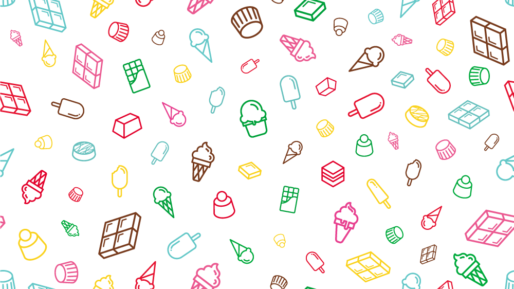
Icons of ice cream and chocolate.
The icons were a great way to include the color palette into the design.
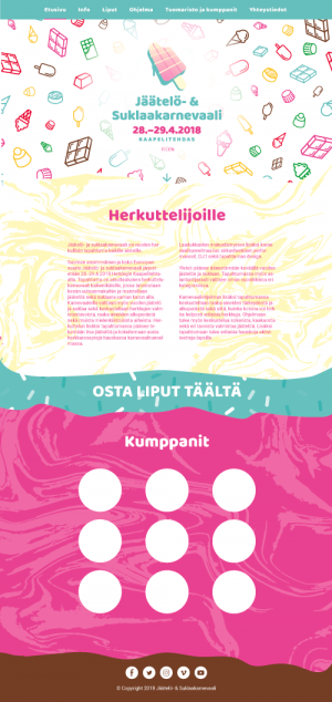
I wanted to do something a bit crazy with the website, so I designed the different sections to drip over each other to make a playful, out of the box feel to it.
After the launch, we upgraded to a more sustainable wireframe.
Continuous backgrounds work well responsively.
The original icon pattern works well on social media platform covers.
Animated advent calendar for social media.
Large colorful surfaces with patterns were the focal point of the visual identity.
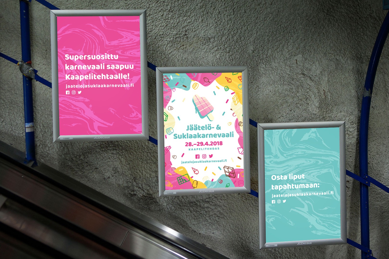
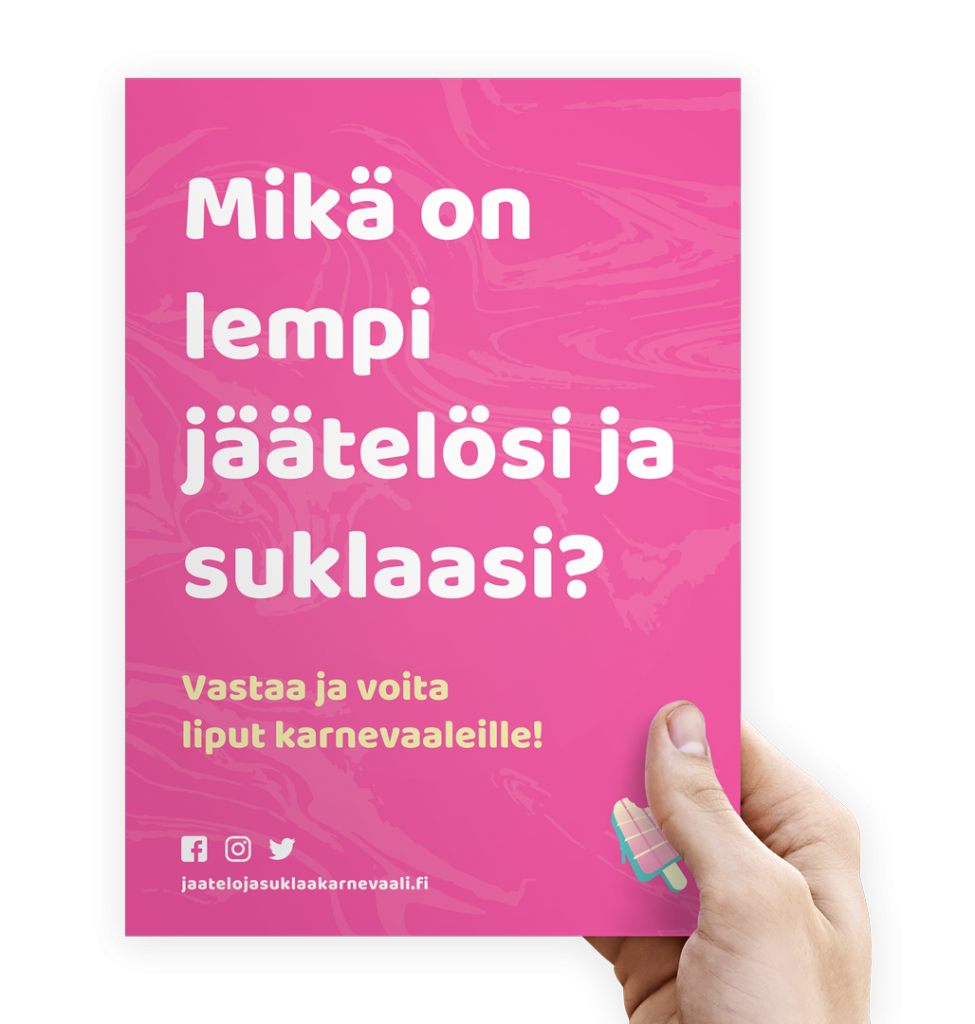
Poster design animated on digital screens.

The programme brochure.
If you like ice cream or chocolate, this event is for you.